Statistical Quality Control (SQC) is the use of statistical methods, such as sampling, averages, ranges and control charts, to monitor, control and improve the quality of a production or service process. Instead of guessing whether things are going well, a manager takes small samples at regular intervals, plots the results and lets the numbers show whether the process is behaving normally or whether something has gone wrong.
The topic matters because no process produces two identical units. A juice-filling machine will put slightly different amounts into each bottle; a call centre will take slightly different times to answer each call. SQC tells the manager which differences are harmless and which are warning signs, so that problems are caught early, defects and waste fall, and the organisation depends less on expensive final inspection.
Objectives and basic idea of SQC
The main objective of SQC is to monitor process variation and keep the process in a state of statistical control so that quality stays within acceptable standards. In practice it answers four questions:
- Is the process working normally?
- Are defects increasing?
- Has a special problem appeared?
- Is corrective action needed now?
The whole subject rests on one idea: variation always exists, but not all variation is dangerous. SQC separates natural, expected variation from unusual variation that signals a problem. This makes quality management preventive and scientific rather than reactive. The approach was developed by Walter Shewhart at Bell Telephone Laboratories in the 1920s and was later promoted worldwide by W. Edwards Deming.
Types of variation in a process
Common cause (chance) variation
This is the natural, random variation built into the process. It comes from many small sources acting together, such as slight machine vibration, minor differences in material, small differences in how a worker performs a task, and normal room temperature changes. A process showing only common-cause variation is said to be in control, and its output is predictable. Reducing common-cause variation usually requires a management decision, such as buying a better machine or changing the method.
Special cause (assignable) variation
This is unusual variation that can be traced to a specific, identifiable cause, for example a machine breakdown, a wrong setting, a defective lot of raw material, a worker mistake or a sudden temperature change. It needs investigation and corrective action. The main job of SQC is to signal when a special cause is probably present.
Main tools of SQC
SQC is usually divided into three broad areas:
- Descriptive statistics: mean, range and standard deviation, which summarise a set of measurements.
- Statistical process control (SPC): taking samples during production and plotting them on control charts to decide whether the process is in control.
- Acceptance sampling: inspecting a random sample from a lot of incoming or finished goods and accepting or rejecting the whole lot on that basis.
Supporting tools include sampling plans, frequency distributions, histograms, Pareto charts, check sheets, cause-and-effect diagrams and scatter diagrams. For most BBA and MBA examinations, the control chart is the most important tool.
Process control and product control
Process control
Process control checks the process while production is going on. Samples are taken at intervals and plotted on control charts so that problems are corrected before many defective units are made. It is preventive.
Product control
Product control checks the finished or incoming product to decide whether a lot should be accepted or rejected. Acceptance sampling is the main technique. It is a judgement on output that already exists, so it detects rather than prevents defects.
What is a control chart?
A control chart is a time-ordered graph of sample results with three horizontal lines:
- Centre line (CL): the process average or expected value.
- Upper control limit (UCL): the highest value expected from common-cause variation alone.
- Lower control limit (LCL): the lowest value expected from common-cause variation alone.
Most charts use three-sigma limits, that is, the centre line plus or minus three standard deviations of the plotted statistic. If the process is stable and the statistic is roughly normal, about 99.7 per cent of points should fall inside these limits, so a point outside is strong evidence of a special cause.
Why control charts are useful
- They show at a glance whether the process is stable.
- They give an early warning before large numbers of defectives are produced.
- They stop operators from over-adjusting a process that is actually fine.
- They provide a record for problem solving and continuous improvement.
Types of control charts
The chart chosen depends on the type of data being collected.
| Chart | Data type | What is plotted | Typical use |
|---|---|---|---|
| X-bar chart | Variable (measured) | Sample mean | Diameter, weight, fill volume, time |
| R chart | Variable (measured) | Sample range | Spread of the same measurements |
| p-chart | Attribute (good/bad) | Proportion defective in a sample | Defective bulbs, wrong invoices |
| np-chart | Attribute (good/bad) | Number defective, constant sample size | Defective units per batch of 100 |
| c-chart | Attribute (count) | Number of defects per unit | Scratches per sheet, errors per page |
Variable data
Variable data are measured on a continuous scale, such as length in millimetres or weight in grams. X-bar and R charts are used together: the X-bar chart watches the process centre, and the R chart watches its spread.
Attribute data
Attribute data are counted: an item is either defective or not, or the number of defects on it is counted. Attribute charts are simpler to use because no measuring instrument is needed, but they need larger samples to give the same information.
Worked example 1: X-bar and R chart
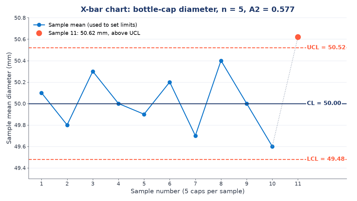
Suppose a plant makes bottle caps with a target diameter of 50 mm. Every hour an inspector measures 5 caps (). The means and ranges of 10 samples are shown below.
| Sample | 1 | 2 | 3 | 4 | 5 | 6 | 7 | 8 | 9 | 10 |
|---|---|---|---|---|---|---|---|---|---|---|
| Mean (mm) | 50.1 | 49.8 | 50.3 | 50.0 | 49.9 | 50.2 | 49.7 | 50.4 | 50.0 | 49.6 |
| Range (mm) | 0.8 | 1.0 | 0.6 | 0.9 | 1.2 | 0.7 | 1.1 | 0.8 | 0.9 | 1.0 |
Step 1: Grand mean. The sum of the ten means is 500.0 mm.
Step 2: Average range. The sum of the ten ranges is 9.0 mm.
Step 3: Control chart factors. From standard tables for : , and .
Step 4: X-bar chart limits.
Step 5: R chart limits.
Step 6: Interpret. All ten means lie between 49.48 and 50.52 mm, and all ten ranges lie between 0 and 1.90 mm, so the process is in control and these limits can be used for future monitoring. Now suppose sample 11 gives a mean of 50.62 mm. It is above the UCL, so the operator should stop and look for a special cause, such as a worn die or a changed machine setting.
Attribute charts: p-chart and c-chart
The p-chart
A p-chart monitors the proportion (fraction) of defective items in a sample. It is used when each item is classed simply as defective or non-defective. For example, if 4 bulbs out of 100 are defective, the proportion defective is 0.04, or 4 per cent. The limits are:
If the LCL comes out negative, it is set to zero, because a proportion cannot be negative.
The c-chart
A c-chart monitors the number of defects per unit when the unit or sample size is constant, for example the number of bubbles, scratches and spots on one painted metal sheet. One sheet may have 3 defects, another 5, another 2. Because defect counts usually follow the Poisson distribution, the standard deviation is the square root of the mean:
For instance, if sheets average defects, then and , which is set to 0.
Difference between p-chart and c-chart
| Point | p-chart | c-chart |
|---|---|---|
| Measures | Proportion of defective items | Count of defects in a unit |
| Each item is | Good or bad | Can have several defects |
| Sample size | May vary | Constant area or unit |
| Underlying distribution | Binomial | Poisson |
| Memory aid | P = proportion defective | C = count of defects |
Worked example 2: p-chart
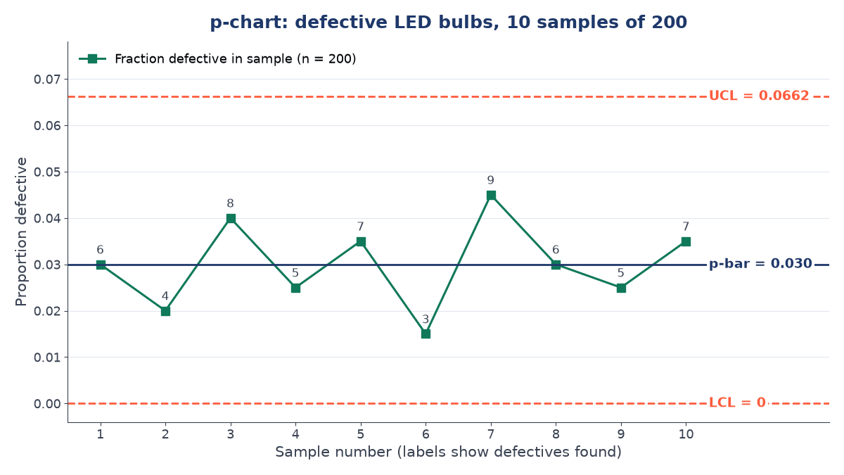
Suppose an LED bulb factory tests 10 samples of 200 bulbs each (). The numbers of defective bulbs found are 6, 4, 8, 5, 7, 3, 9, 6, 5 and 7.
Step 1: Average proportion defective. Total defectives = 60; total inspected = .
Step 2: Standard deviation of the proportion.
Step 3: Control limits.
Step 4: Interpret. The sample proportions range from to . All lie inside 0 to 0.0662, so the defective rate is stable at about 3 per cent. The process is in control, although management may still decide that 3 per cent is too high and work to improve it.
In-control and out-of-control processes
In-control process
A process is in control when points fall randomly inside the limits with no unusual pattern. Only common-cause variation is present, and output is predictable.
Out-of-control process
A process is likely to be out of control when any of the following appears:
- One or more points fall outside the UCL or LCL.
- A run of about seven or more consecutive points lies on one side of the centre line.
- A steady upward or downward trend of several points, often caused by tool wear.
- Repeating cycles or points hugging one limit.
An out-of-control signal means "investigate", not "the product is bad". The cause must be found and removed before the process is trusted again.
Control limits versus specification limits
| Control limits | Specification limits |
|---|---|
| Calculated from process data | Set by the designer or customer |
| Show what the process actually does | Show what the product must achieve |
| Usually applied to sample means or proportions | Applied to individual units |
| Answer "Is the process stable?" | Answer "Is the unit acceptable?" |
A process can be in control yet still produce units outside specification if its natural spread is too wide. The comparison of process spread with the specification width is called process capability.
Role of sampling in SQC
Checking every unit is slow and costly, and for destructive tests (such as testing a fuse by blowing it) it is impossible. SQC therefore relies on samples. A good sample is taken randomly, at regular intervals, and in rational subgroups (units made under similar conditions), so that variation within a sample reflects common causes and variation between samples reveals special causes. In acceptance sampling, a sampling plan states the sample size and the maximum number of defectives allowed before a lot is rejected.
Why SQC is better than only final inspection
Final inspection finds defects after the money has already been spent making them. It is also tiring and error-prone when volumes are high. SQC checks the process during production, so problems are fixed at the source, fewer defectives are made, and inspection effort is reduced. In short, SQC builds quality in rather than inspecting it in.
SQC in manufacturing and services
Manufacturing: bottle fill volumes, shaft diameters, tablet weights, paint defects, bulb failures and weld strength are all monitored with control charts.
Services: banks track the proportion of transactions with errors; hospitals monitor waiting times and infection rates; call centres chart average handling time; airlines track the proportion of flights delayed; restaurants count customer complaints per day.
Advantages and limitations
Advantages of SQC
- Early problem detection before many defectives are produced.
- Better process control and fewer unnecessary adjustments.
- Reduced wastage of material, rework and scrap.
- Better consistency of output and customer satisfaction.
- Better decision making based on facts rather than opinion.
- Lower cost, because sampling is cheaper than 100 per cent inspection.
Limitations of SQC
- It needs correct, honest data; poor measurement gives misleading charts.
- It needs trained people who can calculate limits and read patterns.
- It does not solve problems automatically; it only signals them.
- It may not capture every quality issue, such as design faults or rare defects missed by sampling.
- Sampling always carries some risk of a wrong decision.
SQC compared with quality control
Quality control is the broad function of ensuring products and services meet standards. It includes inspection, testing, supplier checks, training and corrective action. Statistical Quality Control is the part of quality control that uses statistical tools such as sampling and control charts. All SQC is quality control, but not all quality control is statistical.
SQC and continuous improvement
Once special causes are removed and the process is stable, managers can work on reducing common-cause variation, which narrows the control limits over time. SQC therefore supports the Plan-Do-Check-Act cycle, Total Quality Management and Six Sigma programmes. Each improvement is confirmed by the chart: if the new limits are tighter, the change worked.
Key terms
- Statistical Quality Control
- The use of statistical methods to monitor, control and improve quality.
- Common cause variation
- Natural, random variation inherent in a stable process.
- Special cause variation
- Unusual variation from an identifiable source that needs correction.
- Control chart
- A time-ordered plot of sample results with a centre line and upper and lower control limits.
- X-bar chart
- A variables chart that tracks the sample mean, showing the process centre.
- R chart
- A variables chart that tracks the sample range, showing process spread.
- p-chart
- An attributes chart for the proportion of defective items in a sample.
- c-chart
- An attributes chart for the number of defects per unit of constant size.
- Acceptance sampling
- Accepting or rejecting a whole lot on the basis of a random sample.
- Specification limits
- Tolerances set by design or the customer for individual units.
Common questions
What is the main difference between common and special causes of variation?
Common causes are many small, random sources that are always present in a stable process. Special causes are specific, identifiable events such as a broken tool or a bad batch of material. Control charts are designed to signal special causes so that they can be removed.
When should a p-chart be used instead of a c-chart?
Use a p-chart when each item is judged as defective or non-defective and you want the fraction defective. Use a c-chart when you count the number of defects on a unit of constant size, since one unit may carry several defects.
Why are X-bar and R charts used together?
The X-bar chart shows whether the process average has shifted, while the R chart shows whether variability has changed. A process can keep the right average but become more erratic, which only the R chart will reveal.
Does a point inside the control limits mean the product meets specification?
Not necessarily. Control limits describe process behaviour and are calculated from data, while specification limits come from the customer. A stable process with too much natural spread can still produce out-of-specification units.
Why is the lower control limit sometimes set to zero?
For proportions and defect counts, the formula can give a negative value when the average is small. Since a negative proportion or count is impossible, the LCL is set to zero.
Is SQC useful in service organisations?
Yes. Banks, hospitals, airlines and call centres chart error rates, waiting times, delays and complaints in exactly the same way that factories chart dimensions and defects.
References
- Montgomery, D. C. Introduction to Statistical Quality Control. Wiley.
- Shewhart, W. A. (1931) Economic Control of Quality of Manufactured Product. D. Van Nostrand Company.
- Deming, W. E. (1986) Out of the Crisis. MIT Press.
- Stevenson, W. J. Operations Management. McGraw-Hill Education.
- Heizer, J., Render, B. and Munson, C. Operations Management: Sustainability and Supply Chain Management. Pearson.